The real power of a pivot table is seen when data such as case counts are broken down into meaningful information based on attributes such as “Caller County” or “Medical Outcome”.
We can break down information in this manner by selecting desired attributes for the columns and rows area of the pivot designer. Below we start by walking through the steps of braking down a basic case count by “Caller County” and “Medical Outcome”.
If you would like to follow along with this example, please review the previous Pivot View topics included within this documentation for set up examples and steps.
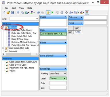
1. Locate and expand the “Attributes” node within the “Attributes” area of the pivot table designer window.
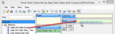
2. Select and drag the “Caller County” attribute to the “Rows” area.
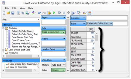
3. Notice that as soon as the “Caller County” attribute is placed into the “Columns” area, the pivot table updates the case count break down to show counts by each county individually.
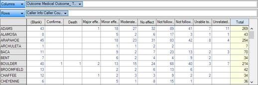
4. While having a breakdown of case counts by county may be helpful, let’s assume we would like to see these counts broken down by the medical outcome for each county. Simply drag and drop the “Medical Outcome” attribute to the “Columns” area and the table will update in real time.
5. The pivot table supports breaking down information multiple levels deep by adding additional attributes to the “Columns” and “Rows” area. For instance, let’s assume we would like to see the medical outcome information for each county broken down by age range. Again, simply drag and drop the Age Range attribute to the “Columns” area and the table will update in real time.
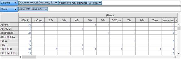
6. We see the information has been updated, but not as readable as we hoped. Let’s place the “Age Range” attribute in front of the “Medical Outcome” to make the data more readable. Drag and drop the Age Range attribute to be just in front of Medical Outcome, then release.
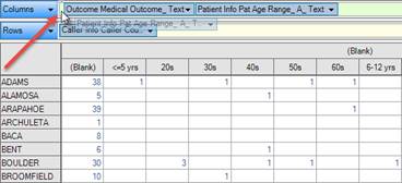
7. The table updates automatically and the Medical Outcome information is easier to understand based on age ranges.
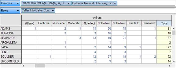
Using creative combinations of attribute placement and adjustments, you can see how easy it is to create a pivot table that reflects the data you need.
In the following sections we will dive deeper into the additional features of the pivot view designer such as quick filters, viewing data as percentages, simple graph charting, and exporting the data.